
How to Style Neutral Interiors with Natural Materials
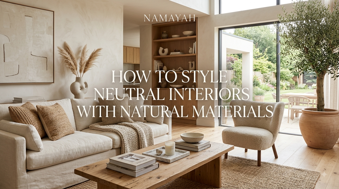
Neutral interiors are easiest to make beautiful when you treat texture and material as carefully as color. Start with warm whites, creams, beige, taupe, or soft stone tones, then layer wood, linen, wool, rattan, stone, ceramic, and natural fibers. Vary the texture, finish, scale, and tone of each material so the room feels calm without becoming flat or monotonous.
What Are Neutral Interiors With Natural Materials?
A neutral interior uses restrained colors rather than highly saturated shades. Typical neutrals include white, cream, beige, tan, taupe, brown, greige, and soft gray. Natural-material styling adds tactile elements such as wood, stone, linen, wool, jute, rattan, clay, and ceramic.
The combination creates a look that can feel warm, relaxed, and timeless without relying on a large number of decorative colors.
Current design coverage continues to emphasize warm neutrals, organic textures, wood, stone, linen, and woven materials as effective ways to give restrained interiors more depth.
The key is not to make every item beige. Instead, think of neutral design as a foundation and natural materials as the layers that give that foundation personality.
Why Natural Materials Work So Well in Neutral Spaces
A room filled with similar smooth surfaces can look visually flat, even when the color palette is attractive. Natural materials introduce differences that the eye can recognize without requiring strong colors.
For example:
- Wood introduces grain and warmth.
- Linen adds softness and subtle irregularity.
- Wool provides a thicker, tactile texture.
- Stone adds weight and visual permanence.
- Rattan introduces a woven pattern.
- Ceramic adds handmade-looking variation.
- Jute and other natural fibers provide texture underfoot.
This approach is especially useful if you prefer minimalist or modern interiors but do not want the room to feel sterile.
The result is similar to the principle behind modern organic interiors: clean forms are balanced with materials that look and feel more organic.
Choose the Right Neutral Color Palette
Begin with two or three closely related neutral tones rather than choosing one color for the entire room.
A warm palette might combine:
- Warm white
- Cream
- Oatmeal
- Sand
- Beige
- Camel
- Natural wood brown
A slightly moodier palette could use:
- Mushroom
- Taupe
- Stone gray
- Walnut
- Soft charcoal
Warm, nuanced neutrals are increasingly being used as alternatives to stark white and cool gray because they can create greater depth and a more relaxed atmosphere.
Pay attention to undertones
Two beige surfaces can look completely different if one has a pink undertone and the other leans yellow or green. Before committing to paint, upholstery, flooring, or cabinetry, view samples in the room’s natural and artificial light.
Rather than matching every neutral exactly, choose colors that share a compatible visual temperature.
Use Wood to Add Warmth and Structure
Wood is one of the easiest ways to keep a neutral room from feeling cold.
Use it for larger pieces such as:
- Coffee tables
- Dining tables
- Bed frames
- Cabinets
- Shelving
- Sideboards
- Flooring
Then repeat the material in smaller doses through frames, bowls, stools, trays, or decorative objects.
You do not need every wood surface to have the same finish. In fact, mixing related wood tones can create a more collected look. The important thing is to maintain balance.
For a lighter interior, oak, ash, or pale timber can reinforce an airy feel. Walnut and darker woods create stronger contrast and can anchor an otherwise pale room.
Layer Linen, Cotton, and Wool
Textiles are essential when styling a neutral room because they add softness without introducing strong color.
Try combining:
- Linen curtains
- Cotton cushions
- Wool throws
- Natural-fiber rugs
- Textured upholstery
- Woven blankets
Do not use exactly the same texture everywhere. A smooth cotton cushion next to a loosely woven linen cushion and a chunky wool throw creates more visual interest than three identical fabrics.
Natural textiles in muted colors are also frequently used to add comfort and tactile depth to contemporary earthy interiors.
Bring in Stone and Ceramic Elements
Stone provides an important counterpoint to soft textiles and warm wood.
Depending on your budget and the room, consider:
- Travertine
- Marble
- Limestone
- Slate
- Granite
- Natural stone accessories
You can introduce stone through a coffee table, countertop, side table, fireplace, tray, lamp base, or decorative object.
Ceramics offer a more accessible alternative. A few handmade-looking bowls, vases, or vessels can add irregularity and craftsmanship without making the room colorful.
The contrast between hard stone, organic wood, and soft fabric is what makes the neutral palette feel dimensional.
Add Rattan, Cane, and Woven Materials
Woven materials are particularly useful when a room needs texture but not more visual clutter.
Consider:
- Rattan chairs
- Cane cabinet doors
- Woven baskets
- Seagrass storage
- Wicker lighting
- Jute rugs
- Woven wall accents
Use them selectively. One large woven pendant or accent chair can be more effective than filling the room with several matching rattan pieces.
The goal is organic texture, not a themed room.
Mix Materials Instead of Matching Everything
One of the most common mistakes in neutral interiors is choosing furniture and accessories from the same material family.
Instead, create a material conversation.
For example:
Light wood + linen + stone + wool + ceramic
or:
Walnut + cotton + rattan + travertine + brushed metal
Each material contributes something different.
A useful rule is to vary at least three characteristics:
- Texture: smooth, rough, woven, soft
- Tone: light, medium, dark
- Finish: matte, polished, unfinished, brushed
This creates contrast while keeping the overall color scheme restrained.
Create Contrast Without Adding Bright Colors
Neutral does not mean low contrast.
You can create definition with:
- Dark wood against cream upholstery
- Black or dark bronze hardware
- Stone with visible veining
- Deep taupe cushions
- A textured rug against a smooth floor
- Sculptural furniture
- Strong light-and-shadow patterns
If the room contains only pale shades, add one or two darker elements to prevent everything from visually blending together.
The contrast should feel intentional rather than dramatic.
Style a Neutral Living Room
Start with a comfortable neutral sofa in linen, cotton, or another textured upholstery.
Then build the room around it:
- Add a wood coffee table.
- Place a textured natural-fiber rug underneath.
- Layer cushions in cream, beige, taupe, and subtle patterns.
- Add a wool or cotton throw.
- Introduce a stone or ceramic accessory.
- Use one woven basket for practical storage.
- Add greenery if it suits the room.
- Finish with warm, layered lighting.
Do not fill every surface. Leaving some empty space allows the natural materials to become visual focal points.
Style a Neutral Bedroom
Bedrooms benefit particularly well from soft materials.
Try:
- An upholstered or wooden bed
- Linen bedding
- A wool or textured throw
- Natural-fiber curtains
- A simple wooden nightstand
- Ceramic lamps or vessels
- A woven bench or basket
Keep the palette slightly softer than in shared living areas. Cream, oatmeal, sand, and warm beige can create a restful base, while medium-toned wood gives the room enough structure.
Style a Neutral Kitchen and Dining Area
Kitchens naturally contain hard surfaces, so use wood and textiles to soften them.
For example, combine:
- Wood cabinetry or open shelving
- Stone countertops
- Ceramic tableware
- Linen napkins
- Wooden cutting boards
- Woven dining chairs
- A natural wood dining table
If the kitchen already has many materials, resist adding more simply for decoration. A neutral kitchen often looks better when each material has room to breathe.
Use Lighting to Highlight Natural Materials
Lighting can completely change how neutral materials appear.
Use multiple sources rather than relying on one overhead fixture:
- Ceiling lighting for general illumination
- Floor lamps for corners
- Table lamps for task areas
- Wall lights for architectural features
- Accent lighting for artwork or shelving
Warm lighting can emphasize the depth of wood, textiles, stone, and earthy finishes. Contemporary interior guidance also emphasizes layered lighting as an important part of creating a comfortable, relaxing atmosphere.
During the day, maximize natural light where possible with appropriately scaled window treatments. Sheer or lightweight natural-fiber curtains can soften daylight without making the room feel enclosed.
Common Mistakes to Avoid
Making everything the same shade
A room consisting entirely of one beige can quickly become flat. Introduce several related tones.
Using too many natural materials at once
Wood, stone, rattan, linen, wool, clay, and jute can work together, but they do not all need equal attention.
Choose a few dominant materials and use the others as accents.
Ignoring contrast
A completely pale room may lack definition. Add darker wood, subtle black accents, or deeper neutral textiles.
Choosing materials only for appearance
Consider durability, maintenance, comfort, and how the material will age. Natural does not automatically mean practical for every application.
Overdecorating
Natural interiors benefit from restraint. A few meaningful objects generally have more impact than shelves filled with accessories.
Forgetting personal character
A perfectly coordinated neutral room can feel impersonal. Add books, artwork, travel objects, vintage pieces, plants, or handmade items that reflect the people who live there.
A Simple Formula for Styling Neutral Interiors
If you are starting from scratch, use this five-step formula:
1. Establish the base.
Choose one main neutral for walls or large architectural surfaces.
2. Add a dominant material.
Wood is a versatile starting point for furniture and flooring.
3. Introduce soft texture.
Layer linen, cotton, wool, or natural-fiber rugs.
4. Add one contrasting material.
Use stone, ceramic, rattan, or a darker wood to create variation.
5. Edit the room.
Remove anything that does not contribute to comfort, function, or character.
The finished space should feel collected rather than decorated all at once.
FAQs
What materials are best for a neutral interior?
Wood, linen, cotton, wool, stone, ceramic, rattan, cane, jute, and other natural fibers are versatile choices. Combine materials with different textures and visual weights instead of using one material repeatedly.
How do I make a neutral room feel warm?
Use warm undertones, natural wood, soft textiles, layered lighting, and tactile accessories. Cream and beige can feel warmer than stark white, while wood and woven materials add visual warmth.
Can neutral interiors have dark colors?
Yes. Dark brown, charcoal, black, and deep earthy tones can provide contrast while keeping the overall palette neutral. Use them selectively in furniture, lighting, hardware, artwork, or accessories.
How many colors should a neutral room have?
There is no fixed number, but a restrained palette of several related neutrals usually creates more depth than one repeated shade. Focus on relationships between tones rather than trying to match everything perfectly.
How can I add natural materials on a budget?
Start with smaller pieces such as linen cushions, woven baskets, wooden accessories, ceramic vessels, cotton throws, and natural-fiber rugs. You do not need to replace every major piece of furniture.
Are natural materials suitable for modern interiors?
Yes. Natural materials can balance clean-lined contemporary furniture particularly well. Wood, stone, linen, and woven materials can soften modern architecture without making the space rustic.
How do I prevent a neutral interior from looking boring?
Prioritize texture, contrast, shape, and material variation. Combine smooth and rough surfaces, light and dark tones, and soft and hard materials. Personal objects and artwork also prevent the room from feeling generic.
Is beige still a good choice for interior design?
Yes. Beige remains a versatile neutral, but the most successful applications usually combine it with different textures, undertones, and contrasting materials rather than using beige as a single flat color.
Conclusion
Styling neutral interiors with natural materials is less about following a strict decorating formula and more about creating depth without visual noise.
Begin with a restrained palette of warm whites, creams, beige, taupe, or earthy stone shades. Then introduce wood for warmth, linen and wool for softness, stone and ceramic for weight, and rattan or other woven materials for organic texture.
Most importantly, avoid making every element match. A successful neutral interior combines different textures, tones, finishes, and forms while maintaining an overall sense of calm.
When natural materials, thoughtful contrast, comfortable textiles, and personal details work together, a neutral room can feel sophisticated, welcoming, and genuinely lived in.